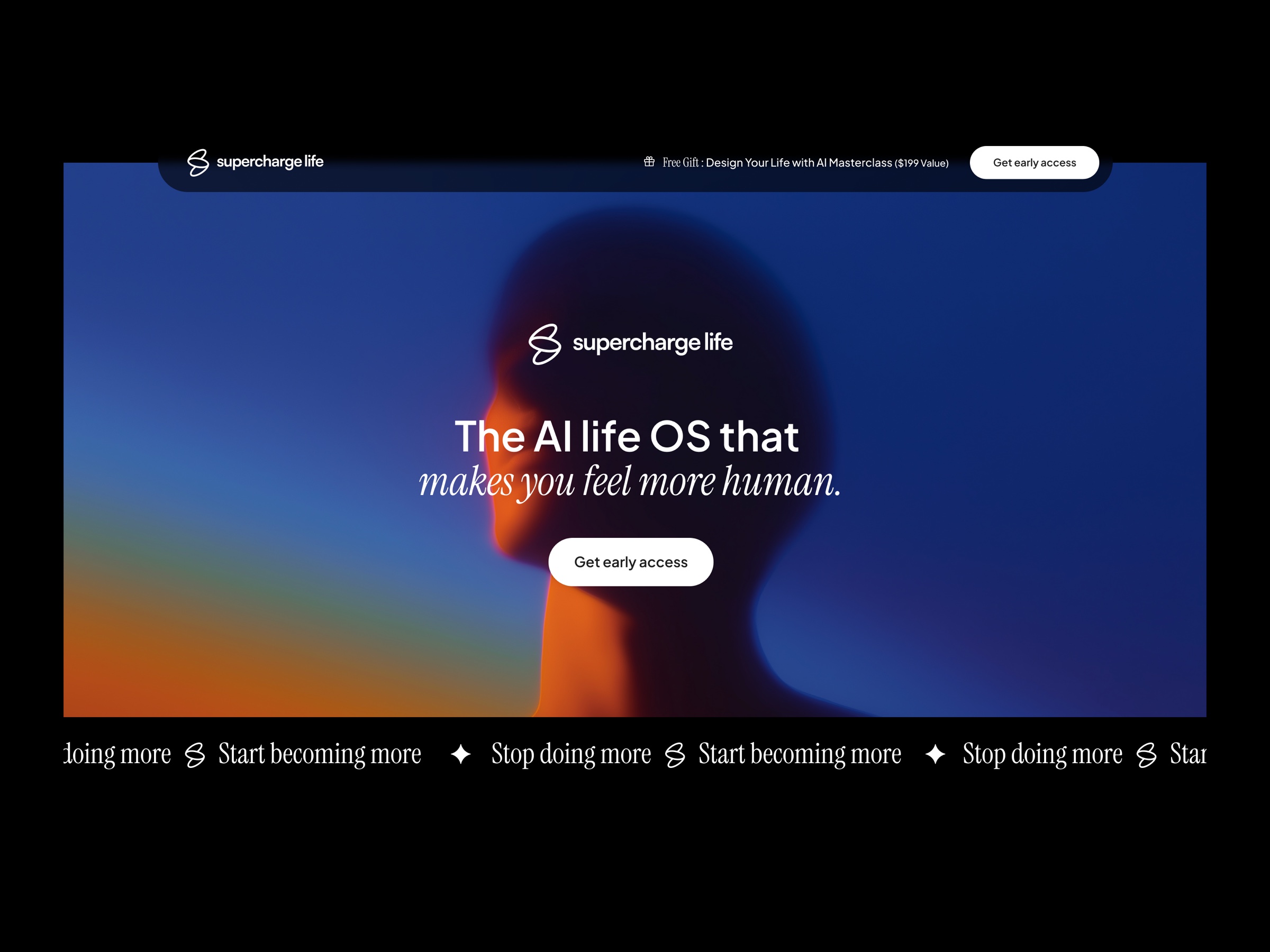
superchargelife.ai is an ai-powered personal operating system for ambitious professionals who want to work smarter, live longer, and grow richer. the brief was to create a brand that feels both sophisticated and human, combining cutting-edge ai technology with authentic personal development.
the visual identity needed to appeal to tech-savvy professionals while avoiding the cold, sterile feel often associated with ai products. the work spans brand identity, ai-led art direction, and the digital experience that introduces the product to the world.
the approach
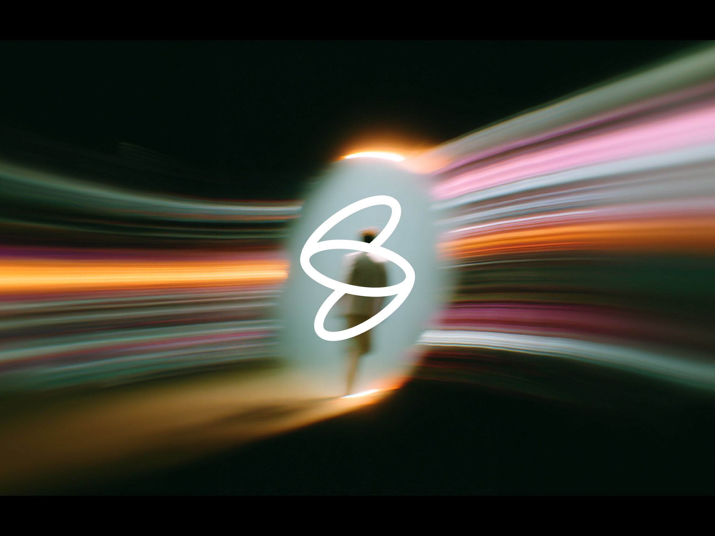
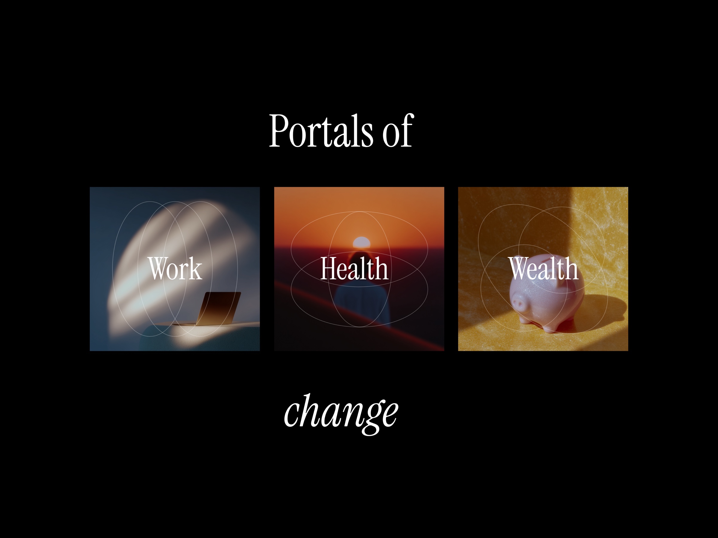
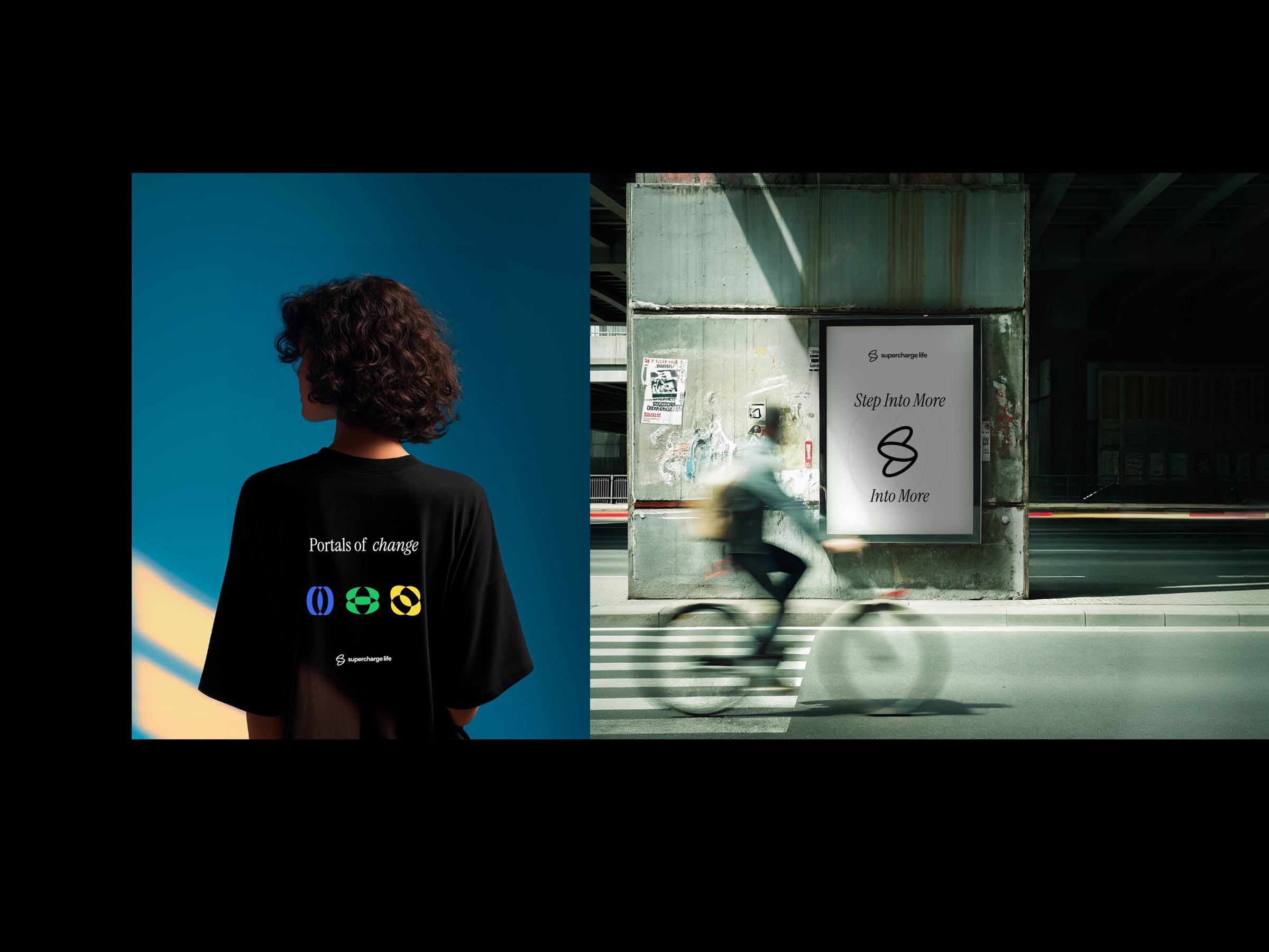
the logo is built on four key design principles. the "three portals" concept uses interconnected elements representing the work os, health os, and wealth os portals. a flowing "charge icon" symbolises the supercharge effect, the acceleration and amplification of human potential. the overall form creates a stylised "s" for supercharge, maintaining brand recognition while embodying deeper meaning. and the "continuous flow" uses smooth, unbroken lines to represent the seamless integration of all life domains through the ai-powered system. the wordmark uses clean, modern typography that feels approachable and human, while holding the sophisticated simplicity of the brand aesthetic.
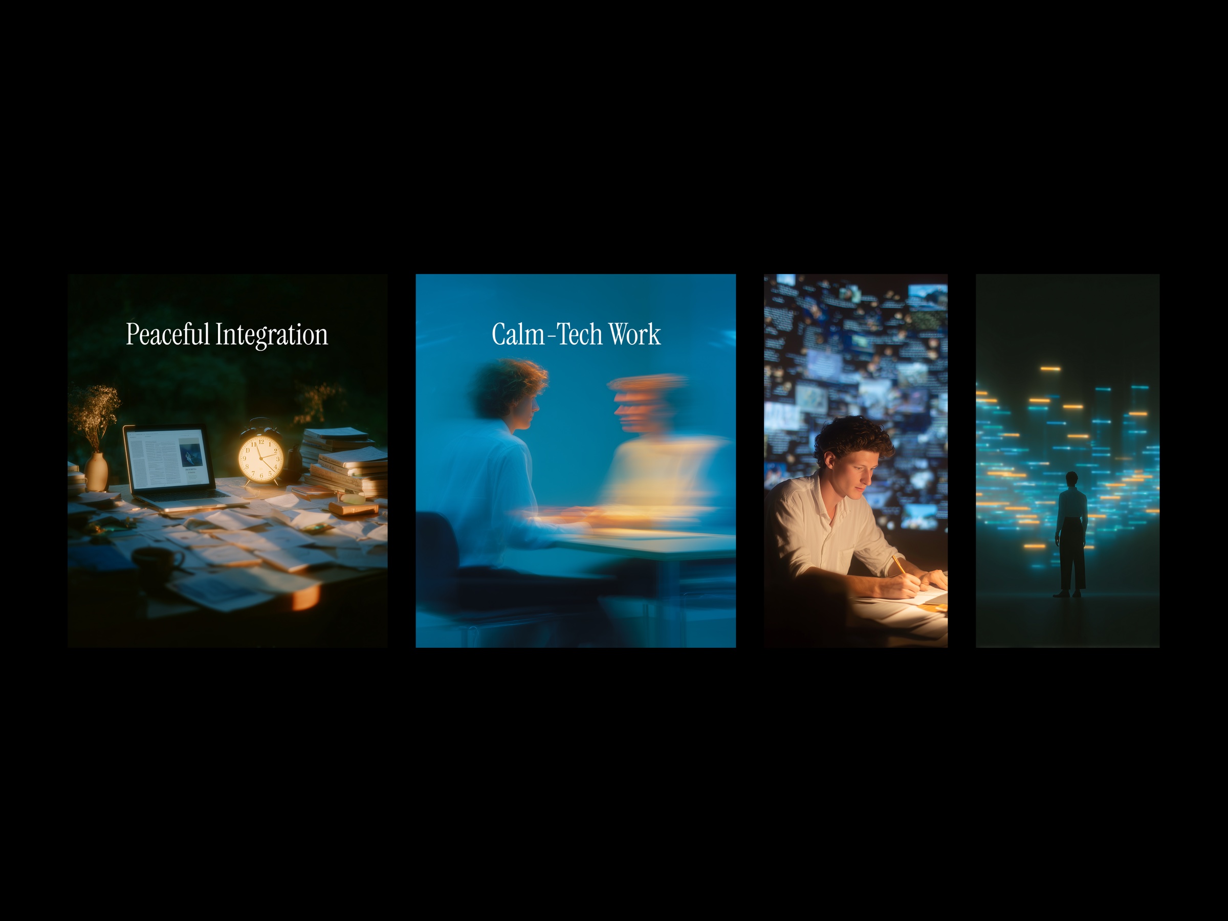
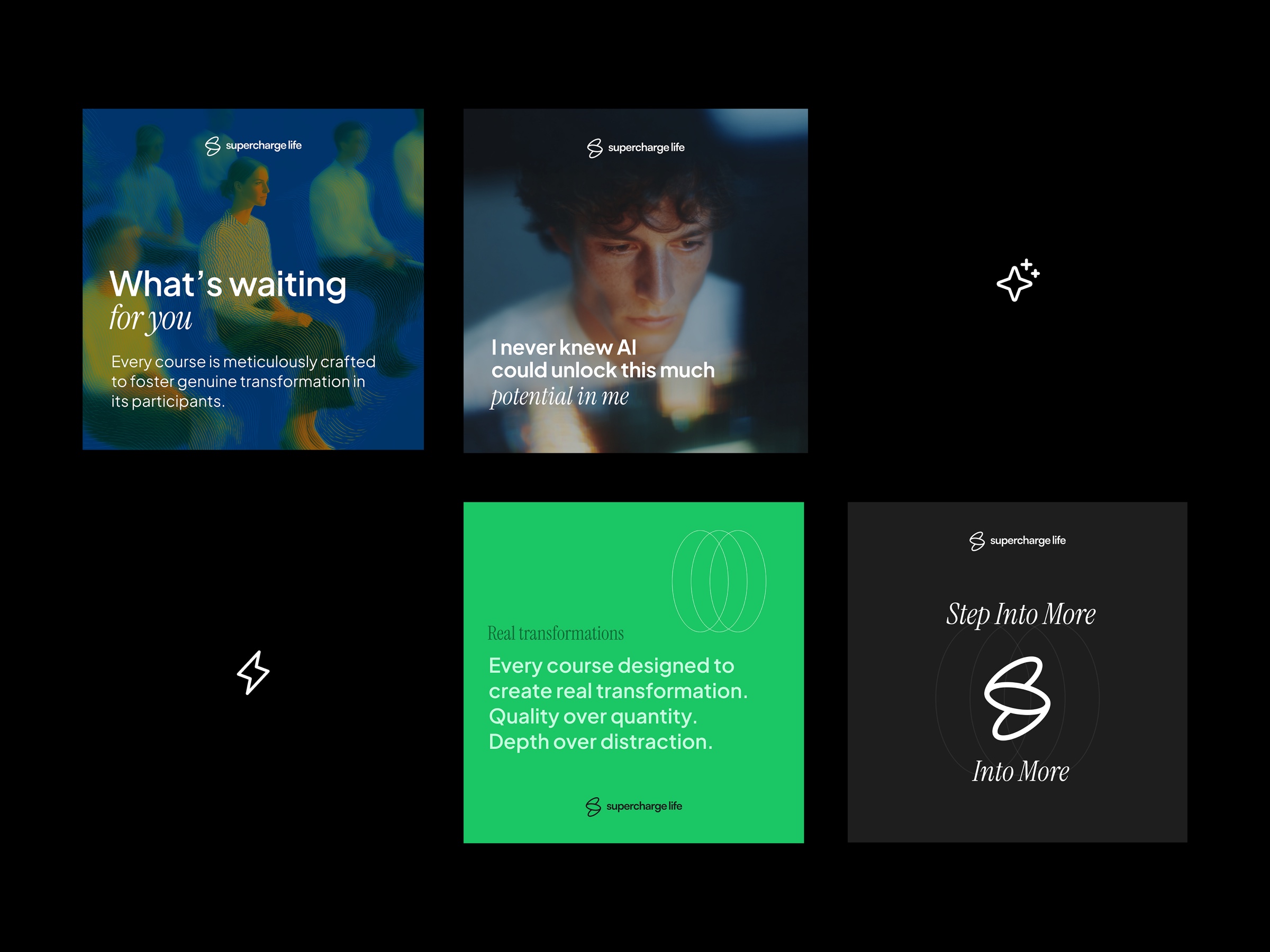
alongside the mark, a distinctive visual language was developed to capture moments that feel both artistic and dreamlike, where calm-tech becomes poetry in motion. the imagery features ethereal workspaces bathed in golden hour light, ai assistance that appears like gentle magic, and people who embody serene focus with an almost cinematic quality. all of it generated through custom midjourney prompts on a consistent profile code, then directed and curated to hold a single atmosphere across the brand.