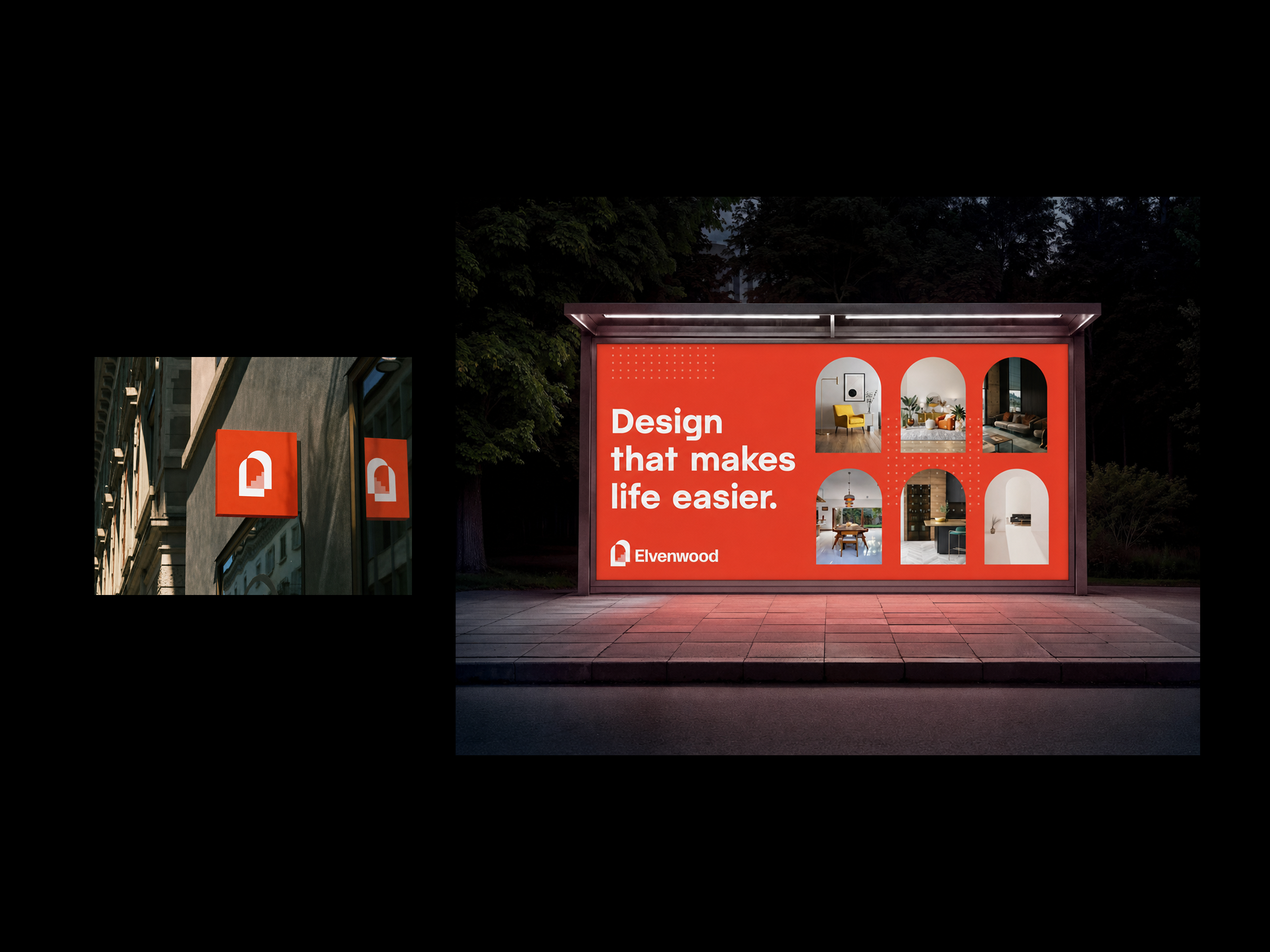
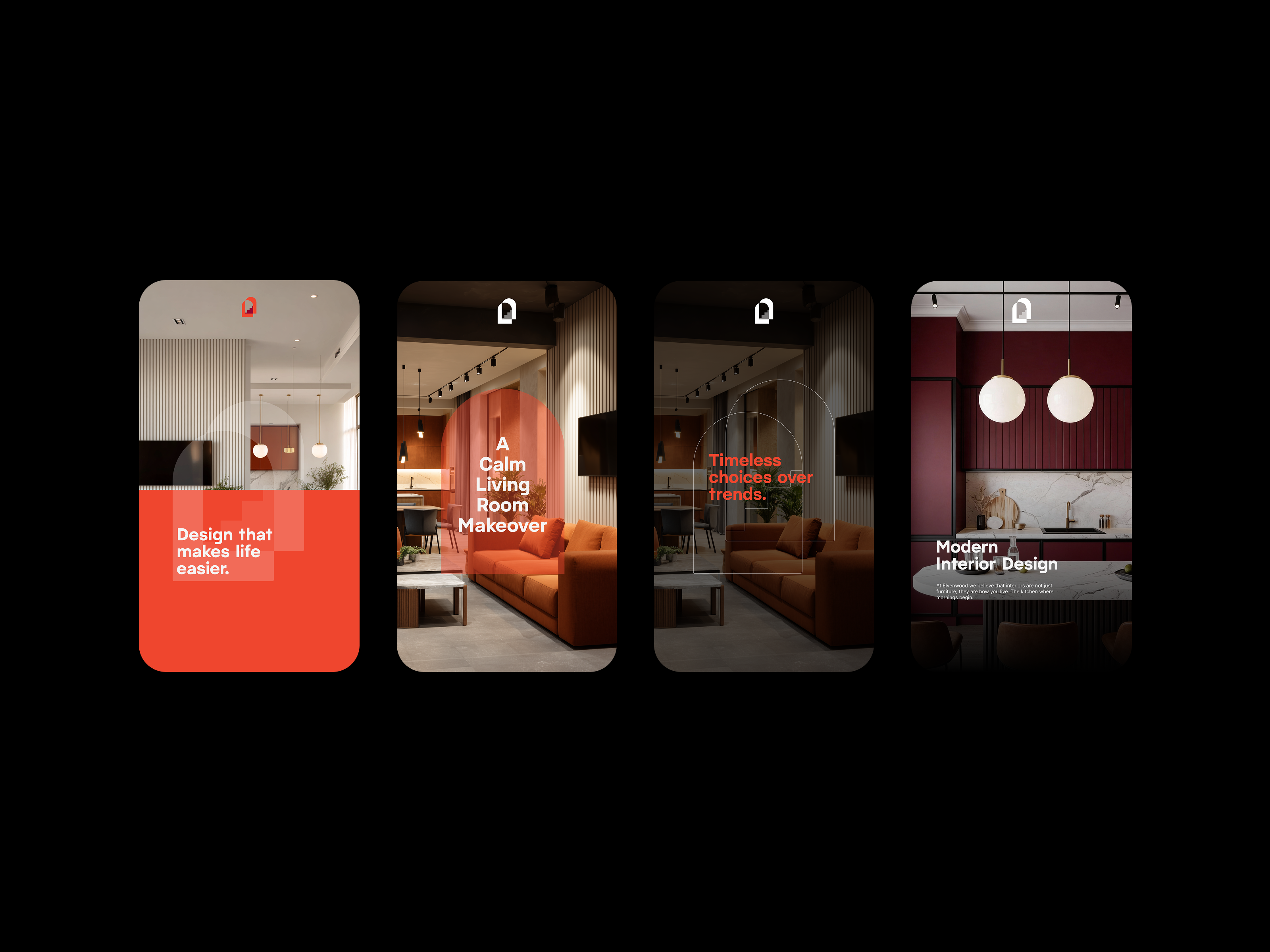
elvenwood was making the shift from B2B corporate interior projects to serving homeowners directly. the rebrand needed to do more than refresh the visuals. it had to reposition the brand's entire emotional register, from transactional and professional to warm, trustworthy, and personal.
the approach
the brief was a repositioning, not a refresh. moving from corporate procurement to homeowners meant the brand had to feel like a person you'd invite into your house, not a vendor you'd negotiate with. every decision was filtered through that shift in audience.
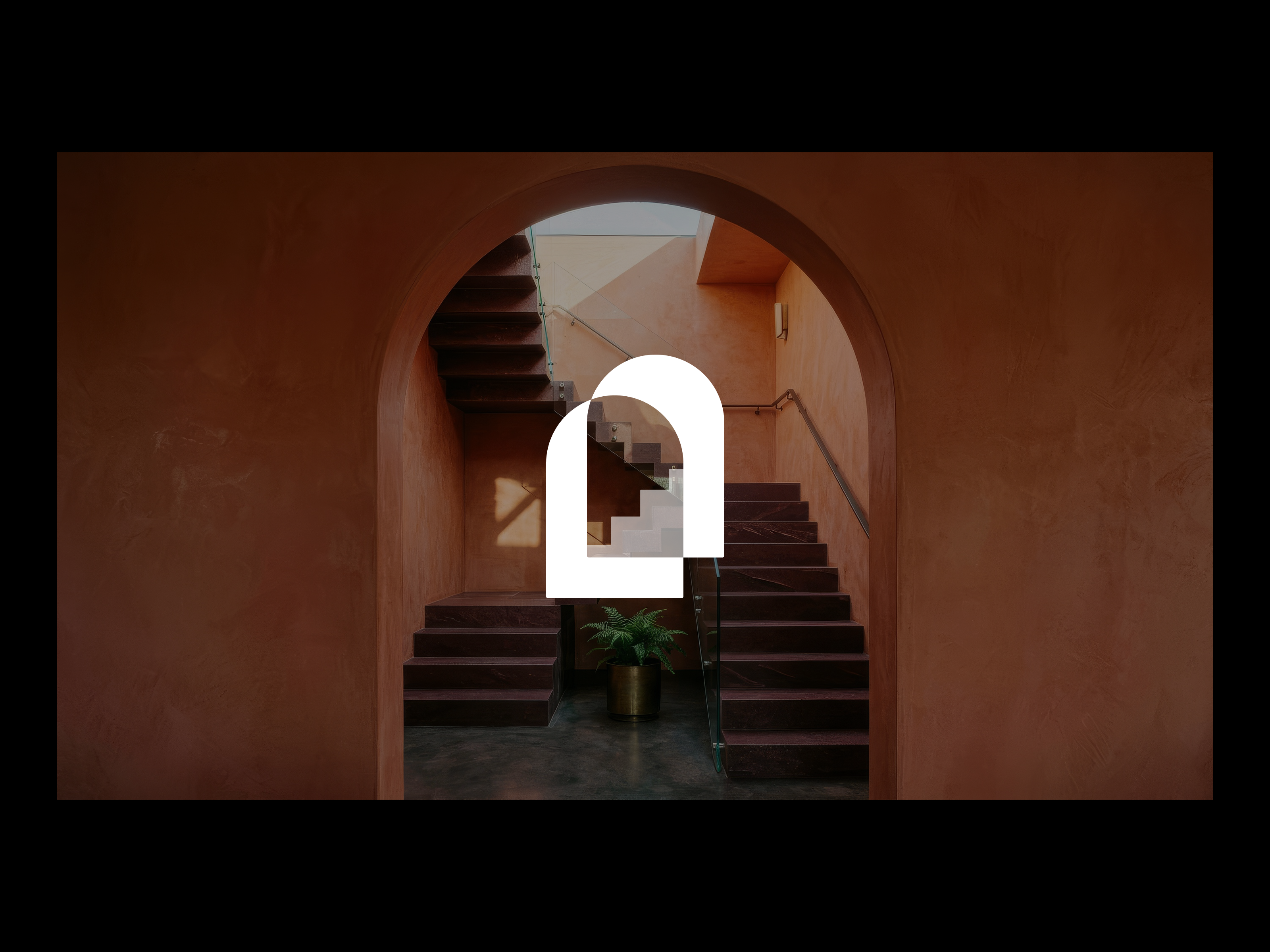
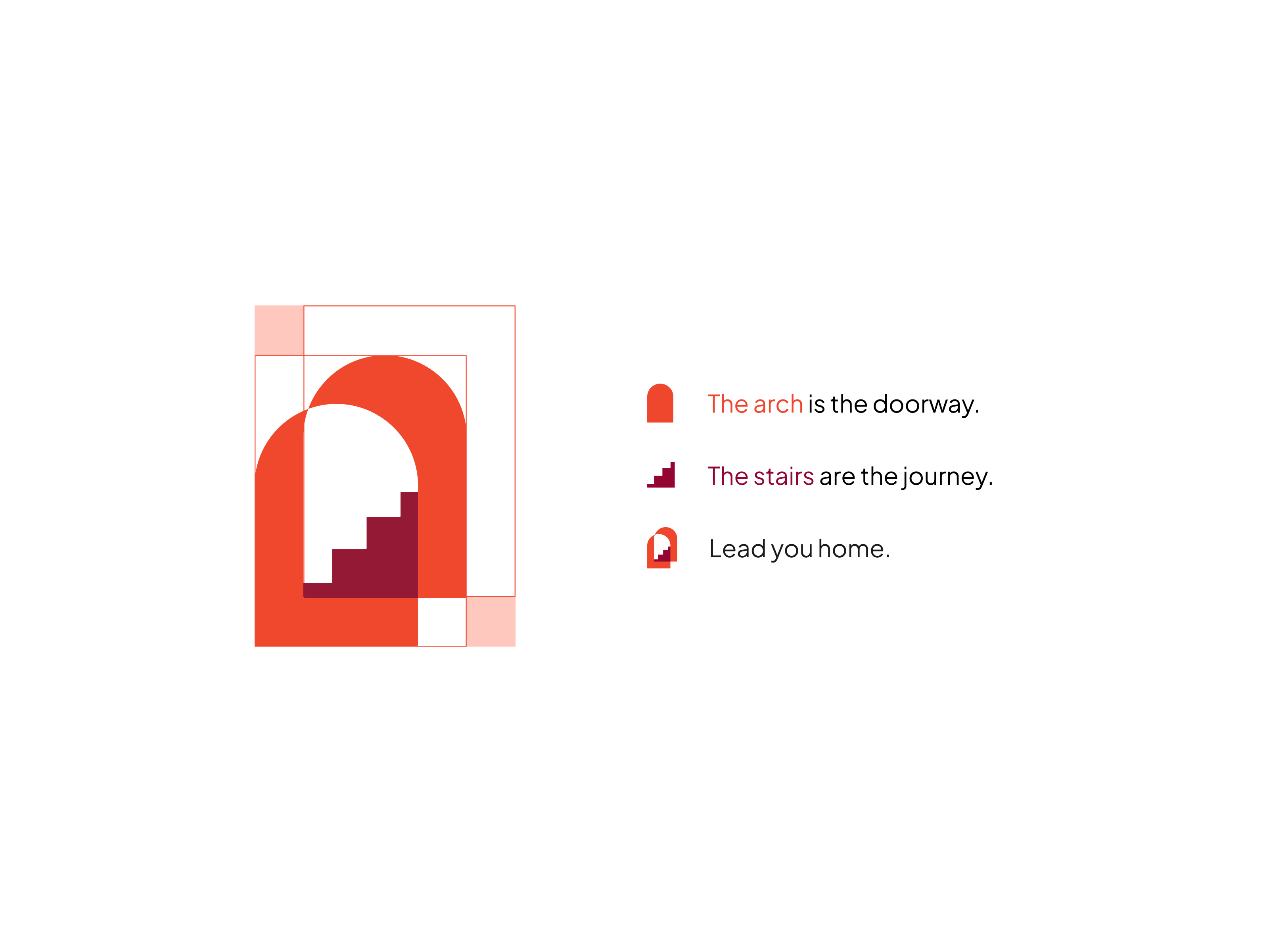
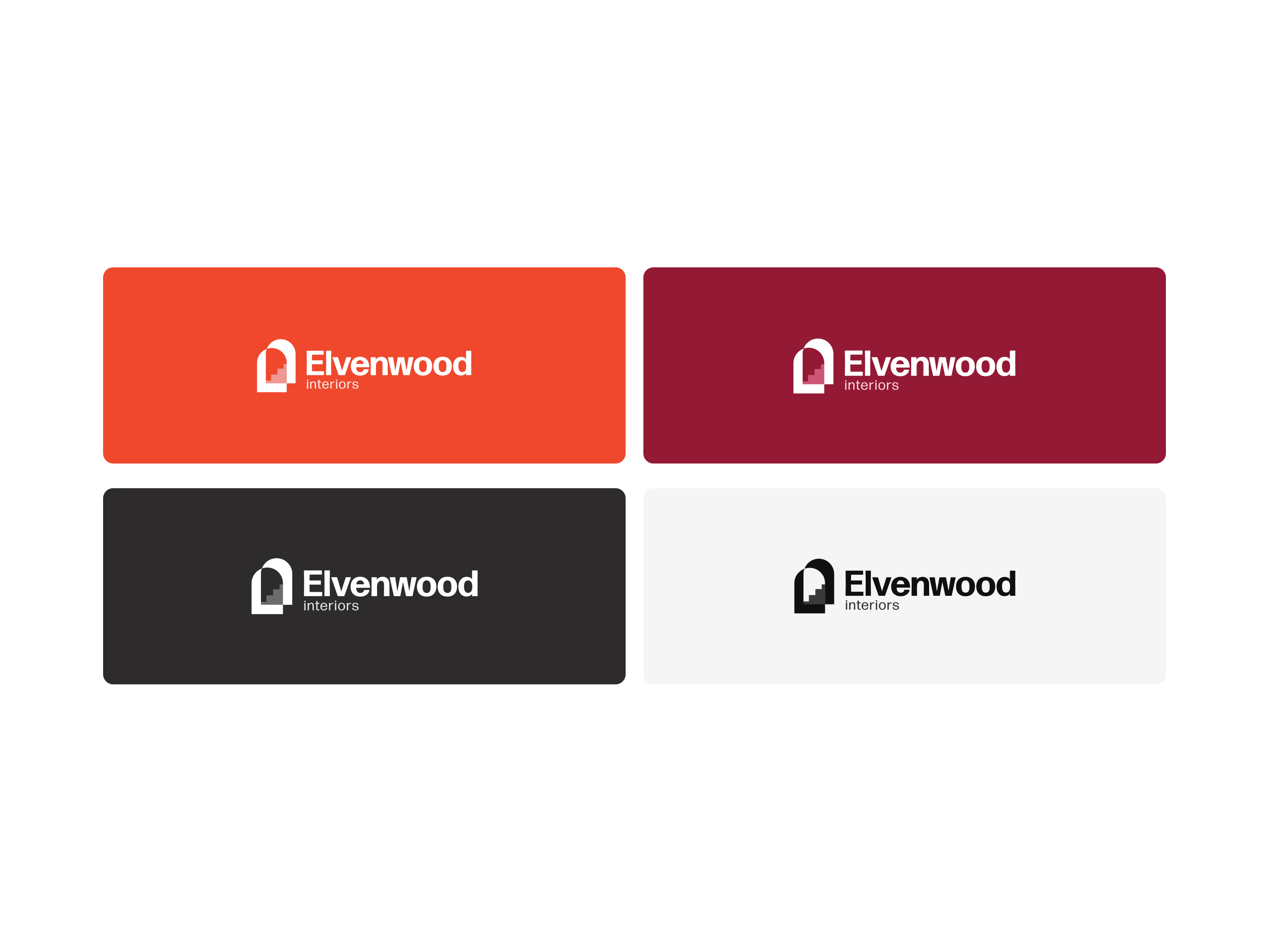
the logo mark combines an arch and a staircase into a single symbol. the doorway as entry, the stairs as journey, together leading you home. one mark holding the whole proposition: this is who walks you through the threshold.
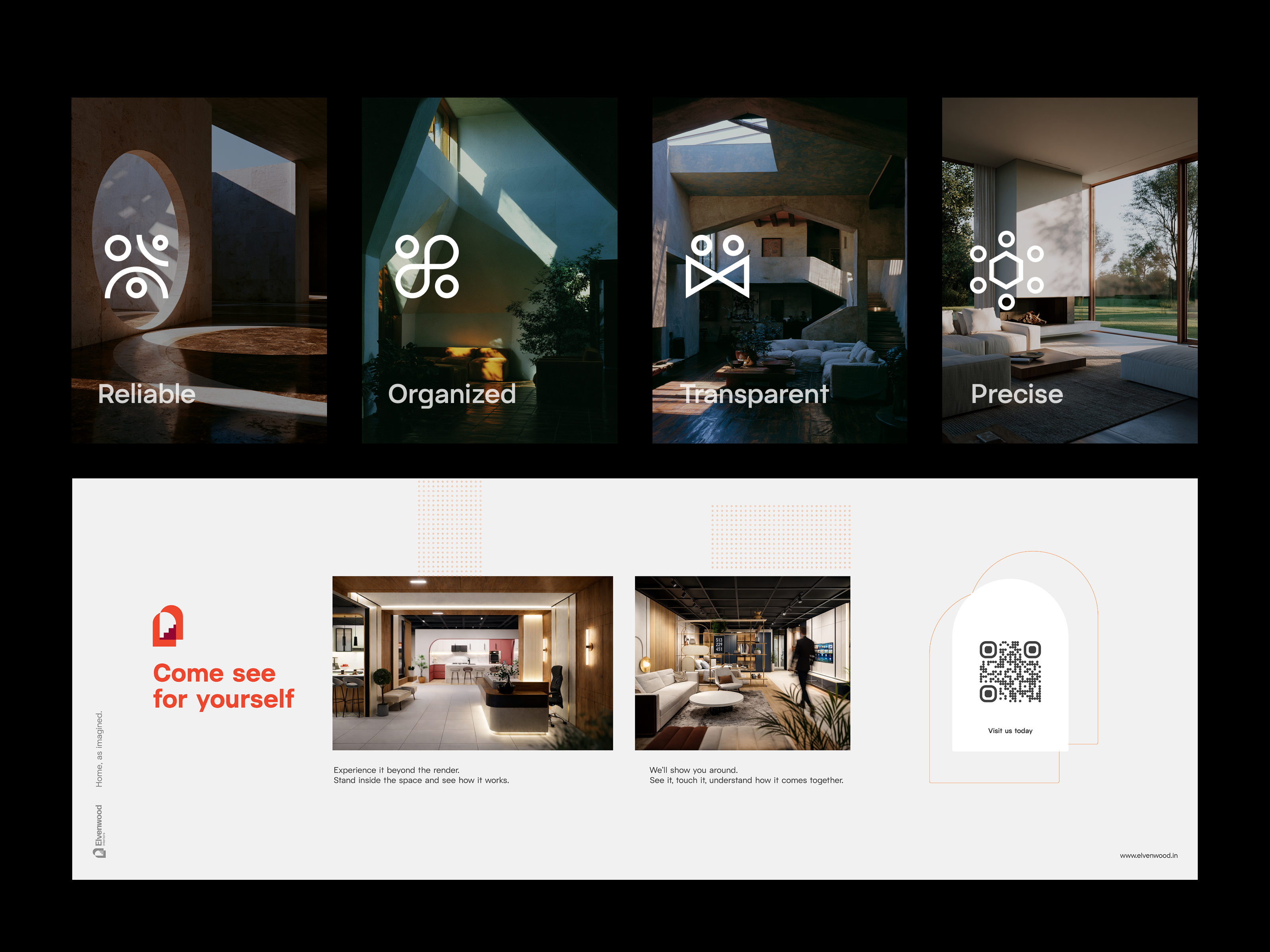
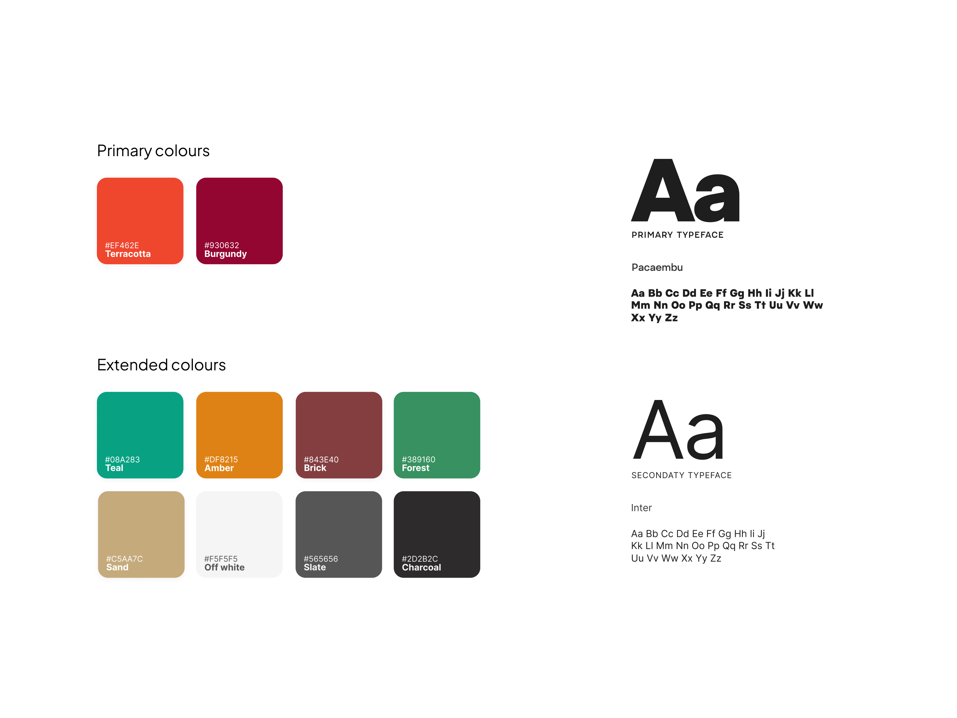
the palette pairs terracotta and burgundy, earthy warmth grounded by depth, replacing the cold neutrals of the corporate interiors world with a colour story that feels lived-in and confident. the typography and supporting language follow the same logic: warm, calm, direct, never slick.